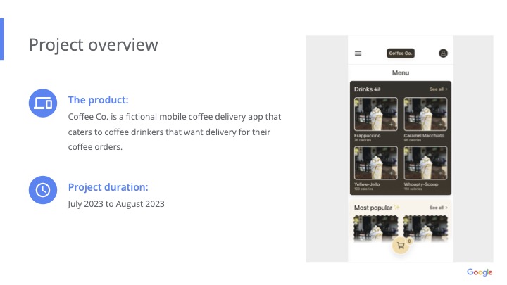
Coffee Co.
A mobile ordering experience for commuters who need coffee pickup or delivery to fit into the workday, not interrupt it.
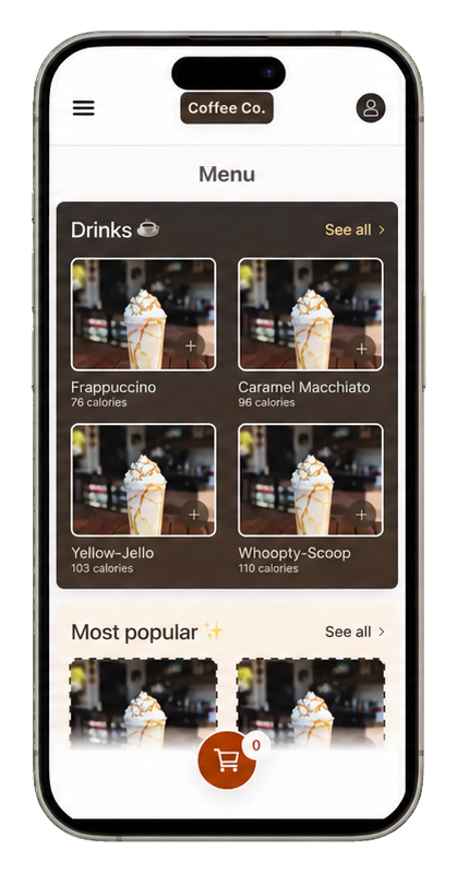
01 / Understanding the problem
Daily Coffeeshould notBreakthe commute
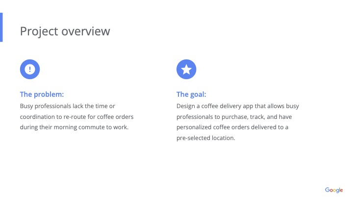
Daily commuters sometimes lack the time, energy, or route flexibility to stop for coffee before or during the workday.
How might we make ordering coffee for pickup or delivery more seamless for daily commuters?
The proposed solution is a coffee application that lets commuters order, edit, pick up, or deliver coffee drinks from nearby cafes without adding unnecessary friction to their route.
Usability study · Little Rock, Arkansas
Four local coffee drinkers tested the ordering flow.
I interviewed four coffee drinkers from my office in Little Rock, Arkansas, a mid-sized city. Participants ranged from 18 to 65 years old, aligning with the broader target audience. Each participant tested the product before taking part in a follow-up usability interview.
Short interviews
What coffee routines already look like.
These composite responses summarize recurring interview themes rather than representing verbatim participant quotes.
How many times a week do you get coffee away from home?
“Usually three or four times. If I have an early meeting, it is almost automatic.”
“Once or twice, mostly when I did not have time to make it at home.”
Which coffee shops do you choose?
“Starbucks is predictable because the app remembers my order.”
“Casey's gas station is on my route. I choose Mylo Coffee Co. or Nexus Coffee Roasters when I have more time.”
What apps do you currently use?
“Mostly the Starbucks app. For local shops, I check Google Maps or order at the counter.”
“I use DoorDash occasionally, but the delivery fees make me hesitate.”
Would you prefer delivery or pickup along your route?
“Pickup if I am already driving; delivery if I am stuck in meetings.”
“Show me which option adds the least time to my commute.”
Would a community of coffee drinkers be useful?
“I do not need another social feed, but I would like to see what people nearby actually order.”
“Local favorites would help me try something beyond my usual drink.”
Market opportunity
The whitespace is not another single-shop app.
Chain apps already make repeat ordering convenient, but they keep discovery inside one brand. Delivery marketplaces provide more choice, yet fees and restaurant-first browsing can make a simple coffee run feel heavy. Coffee Co. can occupy the middle by helping commuters compare nearby shops and learn from community ordering patterns.
02 / Product direction
Make the order feel already on the way 📍
Coffee Co. centers the experience around nearby cafes, quick edits, familiar drink discovery, and simple pickup or delivery choices.
Nearby cafe ordering
Help commuters find coffee options close enough to fit their existing route.
Editable drinks
Support quick changes before checkout so the order stays flexible.
Popular choices
Use community-loved drinks to reduce decision fatigue during busy mornings.
Recently viewed
Bring back drinks that caught the user's eye for easier repeat exploration.
03 / Design process
From human context to polished mobile flows.
The process moved from persona and journey mapping into information architecture, storyboards, low-fidelity wireframes, prototype mapping, high-fidelity refinements, and reusable components.
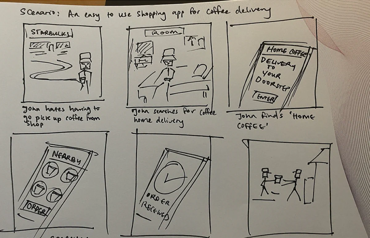
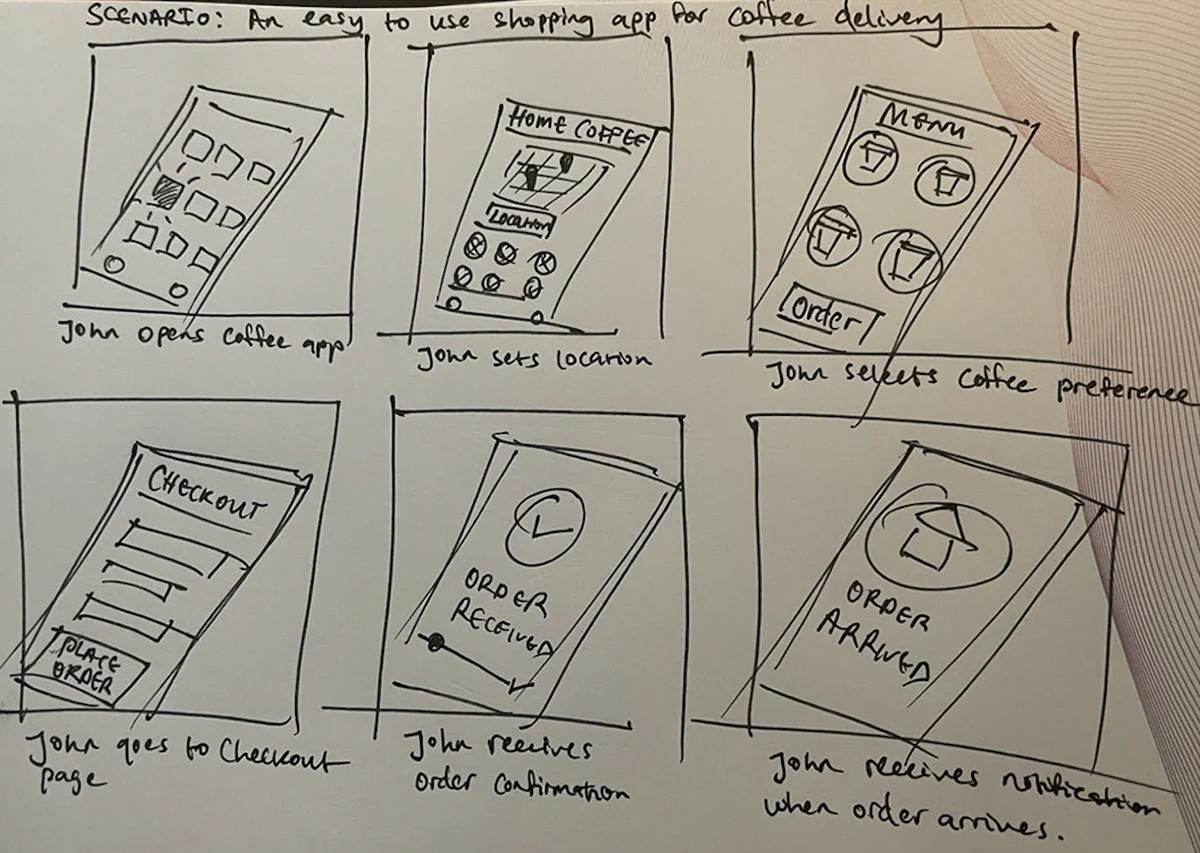
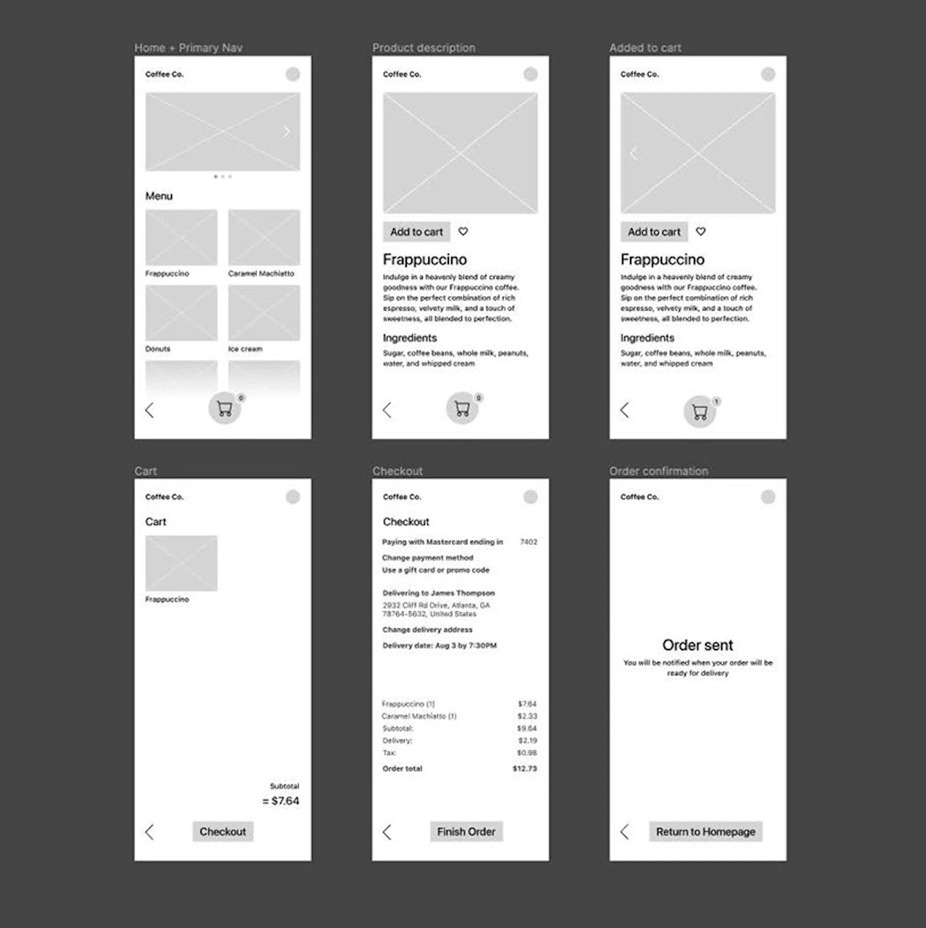
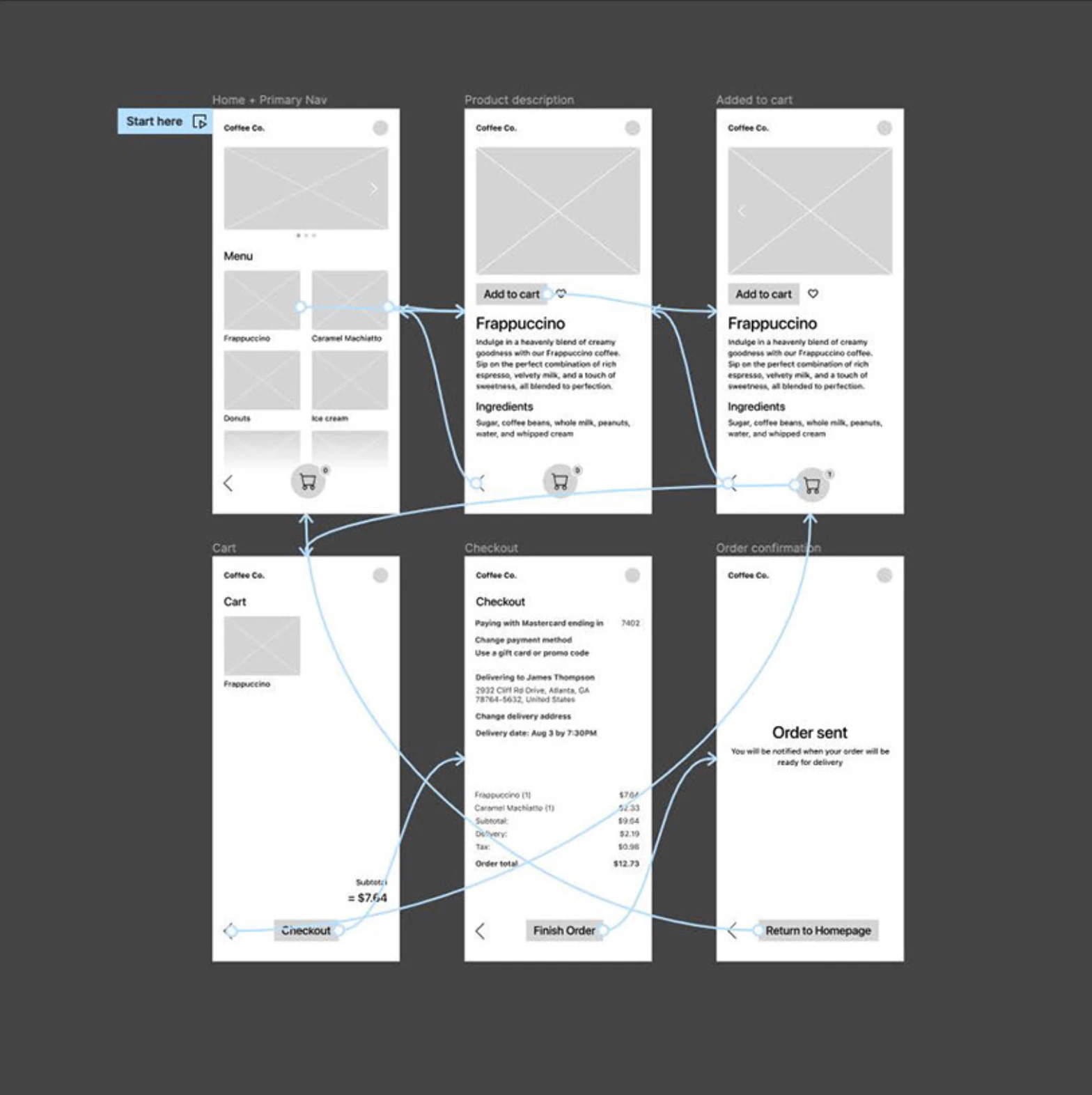
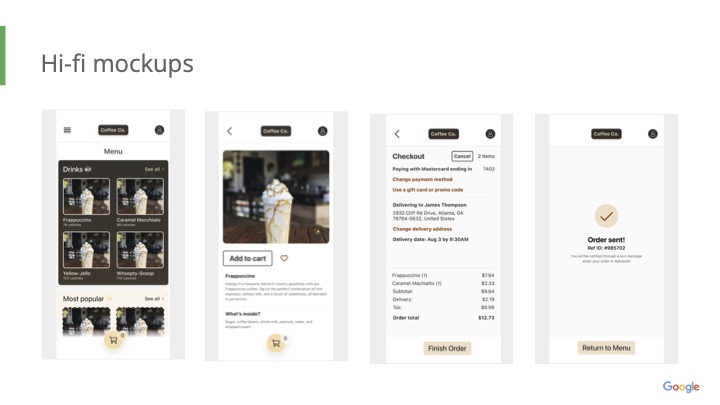
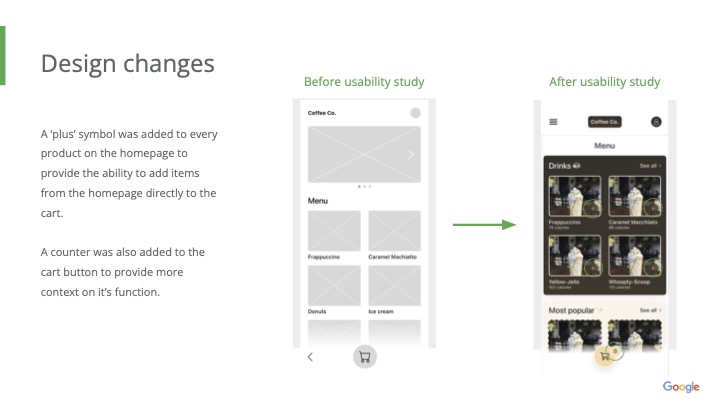
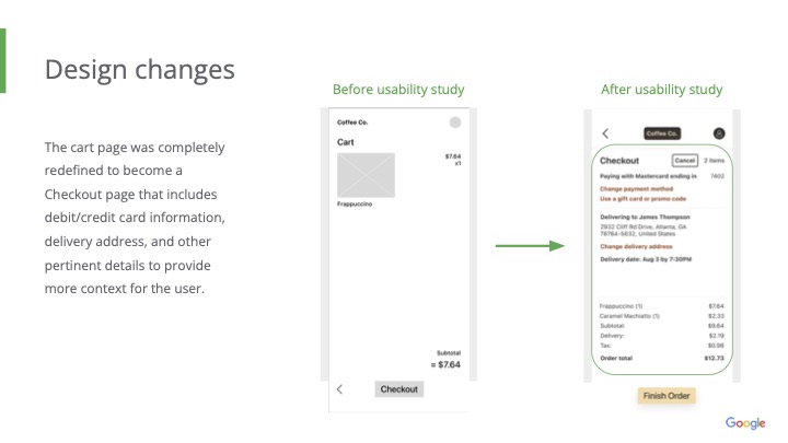
Explore the early lo-fi prototype used to test the initial Coffee Co. ordering flow.
View lo-fi prototype ↗ (opens in a new tab)04 / Design system
A sticker sheet for consistent mobile UI.
The reusable system captured cards, icons, badges, buttons, loaders, typography, and color choices so new Coffee Co. screens could stay visually aligned.
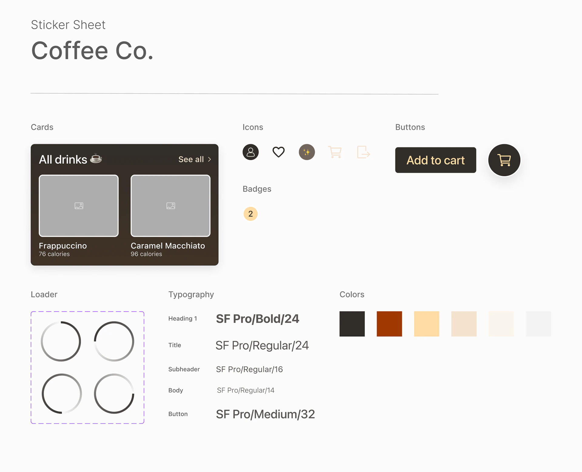
Reusable components. A scalable design system.
The sticker sheet gives the product a stronger foundation for future screens and iteration by making repeated interface patterns easier to reuse consistently.
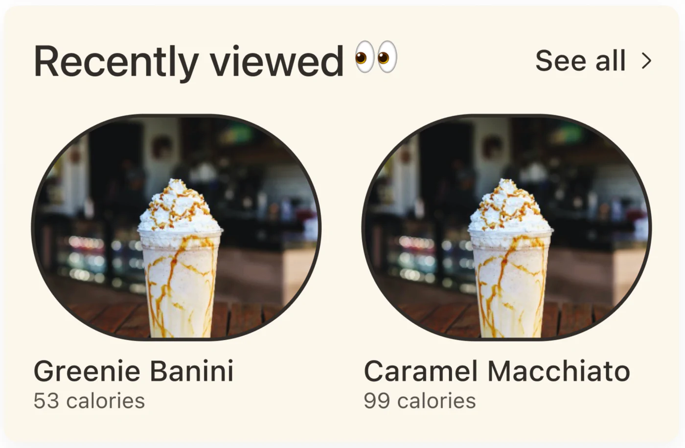
Recently viewed module
The eye-inspired card treatment makes saved attention feel intentional while giving users a fast return path.
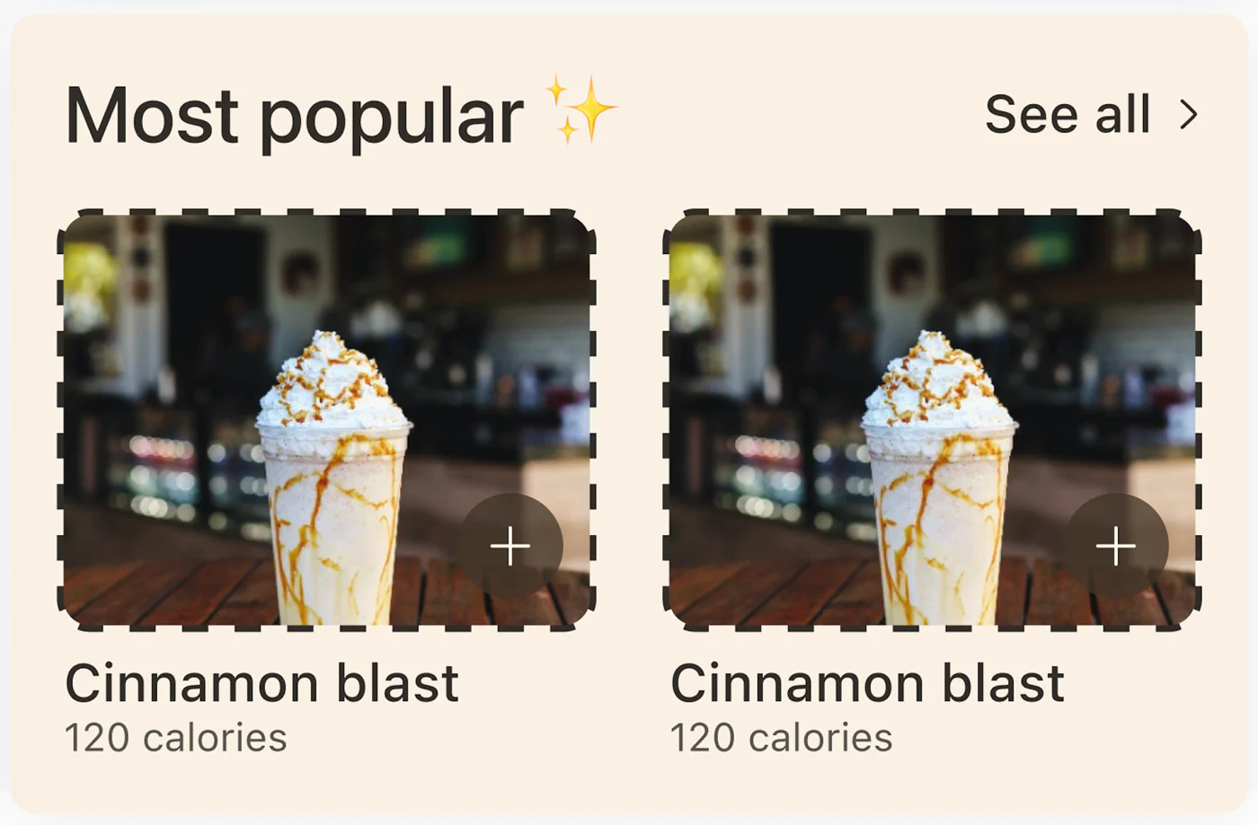
Most popular module
The popular-drink card pattern combines social proof, quick scanning, and clear add-to-cart affordances.
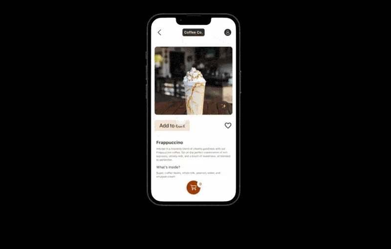
05 / Final screens
Coffee ordering designed to fit the commute.
Busy people can order, edit, and choose pickup or delivery from nearby cafes without disrupting their route or workday.
06 / Possible impact
Small ordering moments can create a calmer morning.
Coffee Co. is positioned to reduce route uncertainty, speed up repeat ordering, and make local cafe discovery feel useful during a commuter's tight schedule.
Less commute friction
Location-aware discovery helps commuters find coffee options close enough to fit their existing route.
Faster repeat decisions
Recently viewed and popular drink modules reduce the amount of searching required on busy mornings.
Community-informed discovery
Community-loved drinks reveal local favorites and give commuters a faster, more relevant place to start.
07 / Reflection
Usability studies helped challenge designer bias.
What I learned
Initial designs are not always the best solution. Testing with coffee drinkers helped surface useful insights and reinforced the value of usability studies, market research, and continued product iteration.